Posts

Showing posts with the label statistics

We share an ancestor who probably lived no more than 640 years ago

Image
This post is a revised version of a previous post . The original post has been or will be deleted, with the comments preserved. Typically this is done with posts that attract many visits at the time they are published, and whose topics become particularly relevant or need to be re-addressed at a later date. *** We all evolved from one single-celled organism that lived billions of years ago. I don’t see why this is so hard for some people to believe, given that all of us also developed from a single fertilized cell in just 9 months. However, our most recent common ancestor is not that first single-celled organism, nor is it the first Homo sapiens, or even the first Cro-Magnon. The majority of the people who read this blog probably share a common ancestor who lived no more than 640 years ago. Genealogical records often reveal interesting connections - the figure below has been cropped from a larger one from Pinterest . You and I, whoever you are, have each two parents. Each of our parent...

The 2013 PLoS ONE sugar and diabetes study: Sugar from fruits is harmless

Image
A new study linking sugar consumption with diabetes prevalence has gained significant media attention recently. The study was published in February 2013 in the journal PLoS ONE ( ). The authors are Sanjay Basu, Paula Yoffe, Nancy Hills and Robert H. Lustig. Among the claims made by the media is that “… sugar consumption — independent of obesity — is a major factor behind the recent global pandemic of type 2 diabetes” ( ). As it turns out, the effects revealed by the study seem to be very small, which may actually be a side effect of data aggregation; I will discuss this further below. Fruits are exonerated Let me start by saying that this study also included in the analysis the main natural source of sugar, fruit, as a competing variable (competing with the effects of sugar itself), and found it to be unrelated to diabetes. As the authors note: “None of the other food categories — including fiber-containing foods (pulses, nuts, vegetables, roots, tubers), fruits, meats, cereals, and ...

The steep obesity increase in the USA in the 1980s: In a sense, it reflects a major success story

Image
Obesity rates have increased in the USA over the years, but the steep increase starting around the 1980s is unusual. Wang and Beydoun do a good job at discussing this puzzling phenomenon ( ), and a blog post by Discover Magazine provides a graph (see below) that clear illustrates it ( ). What is the reason for this? You may be tempted to point at increases in calorie intake and/or changes in macronutrient composition, but neither can explain this sharp increase in obesity in the 1980s. The differences in calorie intake and macronutrient composition are simply not large enough to fully account for such a steep increase. And the data is actually full of oddities. For example, an article by Austin and colleagues (which ironically blames calorie consumption for the obesity epidemic) suggests that obese men in a NHANES (2005–2006) sample consumed only 2.2 percent more calories per day on average than normal weight men in a NHANES I (1971–1975) sample ( ). So, what could be the main reason ...

The China Study II: Wheat’s total effect on mortality is significant, complex, and highlights the negative effects of low animal fat diets

Image
The graph below shows the results of a multivariate nonlinear WarpPLS ( ) analysis including the variables listed below. Each row in the dataset refers to a county in China, from the publicly available China Study II dataset ( ). As always, I thank Dr. Campbell and his collaborators for making the data publicly available. Other analyses based on the same dataset are also available ( ).     - Wheat: wheat flour consumption in g/d.     - Aprot: animal protein consumption in g/d.     - PProt: plant protein consumption in g/d.     - %FatCal: percentage of calories coming from fat.     - Mor35_69: number of deaths per 1,000 people in the 35-69 age range.     - Mor70_79: number of deaths per 1,000 people in the 70-79 age range. Below are the total effects of wheat flour consumption, along with the number of paths used to calculate them, and the respective P values (i.e., probabilities that the effects are due to chance). Total effect...

HCE user experience: The anabolic range may be better measured in seconds than repetitions

Image
It is not uncommon for those who do weight training to see no gains over long periods of time for certain weight training exercises (e.g., overhead press), even while they experience gains in other types of exercise (e.g., regular squats). HealthCorrelator for Excel (HCE) and its main outputs, coefficients of association and graphs ( ), have been helping some creative users identify the reasons why they see no gains, and break out of the stagnation periods. It may be a good idea to measure the number of seconds of effort per set; in addition to other variables such as numbers of sets and repetitions, and the amount of weight lifted. In some cases, an inverted J curve, full or partial (just the left side of it), shows up suggesting that the number of seconds of effort in a particular type of weight training exercise is a better predictor of muscle gain than the number of repetitions used. The inverted J curve is similar to the one discussed in a previous post on HCE used for weight trai...

Finding your sweet spot for muscle gain with HCE

Image
In order to achieve muscle gain, one has to repeatedly hit the “supercompensation” window, which is a fleeting period of time occurring at some point in the muscle recovery phase after an intense anaerobic exercise session. The figure below, from Vladimir Zatsiorsky’s and William Kraemer’s outstanding book Science and Practice of Strength Training ( ) provides an illustration of the supercompensation idea. Supercompensation is covered in more detail in a previous post ( ). Trying to hit the supercompensation window is a common denominator among HealthCorrelator for Excel (HCE) users who employ the software ( ) to maximize muscle gain. (That is, among those who know and subscribe to the theory of supercompensation.) This post outlines what I believe is a good way of doing that while avoiding some pitfalls. The data used in the example that follows has been created by me, and is based on a real case. I disguised the data, simplified it, added error etc. to make the underlying method rel...

Triglycerides, VLDL, and industrial carbohydrate-rich foods

Image
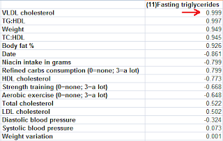
Below are the coefficients of association calculated by HealthCorrelator for Excel (HCE) for user John Doe. The coefficients of association are calculated as linear correlations in HCE ( ). The focus here is on the associations between fasting triglycerides and various other variables. Take a look at the coefficient of association at the top, with VLDL cholesterol, indicated with a red arrow. It is a very high 0.999. Whoa! What is this – 0.999! Is John Doe a unique case? No, this strong association between fasting triglycerides and VLDL cholesterol is a very common pattern among HCE users. The reason is simple. VLDL cholesterol is not normally measured directly, but typically calculated based on fasting triglycerides, by dividing the fasting triglycerides measurement by 5. And there is an underlying reason for that - fasting triglycerides and VLDL cholesterol are actually very highly correlated, based on direct measurements of these two variables. But if VLDL cholesterol is calcula...

The China Study II: How gender takes us to the elusive and deadly factor X

Image
The graph below shows the mortality in the 35-69 and 70-79 age ranges for men and women for the China Study II dataset. I discussed other results in my two previous posts ( ) ( ), all taking us to this post. The full data for the China Study II study is publicly available ( ). The mortality numbers are actually averages of male and female deaths by 1,000 people in each of several counties, in each of the two age ranges. Men do tend to die earlier than women, but the difference above is too large. Generally speaking, when you look at a set time period that is long enough for a good number of deaths (not to be confused with “a number of good deaths”) to be observed, you tend to see around 5-10 percent more deaths among men than among women. This is when other variables are controlled for, or when men and women do not adopt dramatically different diets and lifestyles. One of many examples is a study in Finland ( ); you have to go beyond the abstract on this one. As you can see from the gr...

The China Study II: Gender, mortality, and the mysterious factor X

Image
WarpPLS  and HealthCorrelator for Excel were used to do the analyses below. For other China Study analyses, many using WarpPLS as well as HealthCorrelator for Excel, click here . For the dataset used, visit the HealthCorrelator for Excel site  and check under the sample datasets area. As always, I thank Dr. T. Colin Campbell and his collaborators for making the data publicly available for independent analyses . In my previous post  I mentioned some odd results that led me to additional analyses. Below is a screen snapshot summarizing one such analysis, of the ordered associations between mortality in the 35-69 and 70-79 age ranges and all of the other variables in the dataset. As I said before, this is a subset of the China Study II dataset, which does not include all of the variables for which data was collected. The associations shown below were generated by HealthCorrelator for Excel. The top associations are positive and with mortality in the other range (the “M...

The China Study II: Animal protein, wheat, and mortality … there is something odd here!

Image
WarpPLS  and HealthCorrelator for Excel  were used in the analyses below. For other China Study analyses, many using WarpPLS and HealthCorrelator for Excel, click here . For the dataset used, visit the HealthCorrelator for Excel site  and check under the sample datasets area. I thank Dr. T. Colin Campbell and his collaborators at the University of Oxford for making the data publicly available for independent analyses . The graph below shows the results of a multivariate linear WarpPLS analysis including the following variables: Wheat (wheat flour consumption in g/d), Aprot (animal protein consumption in g/d), Mor35_69 (number of deaths per 1,000 people in the 35-69 age range), and Mor70_79 (number of deaths per 1,000 people in the 70-79 age range). Just a technical comment here, regarding the possibility of ecological fallacy . I am not going to get into this in any depth now, but let me say that the patterns in the data suggest that, with the possible exception...